Friday 19 December 2014

Front Cover Final Idea (First Draft/Editing)

This is what my current idea of my front cover looking. I think that I'm on the right line on where I've positioned my cover lines but I feel that they is still more things that I need more to look move of a front page as it still looks plain and boring. What I'm going to do is that I'm  going ask my classmate what I can improve to make it look like an actual music magazine. I will come back to complete it.

Thursday 18 December 2014

Magazine Development: Front Cover Pt 2:

This post is the second part of my development for my front cover that will be my final idea which a new and better picture.

1) Front Cover
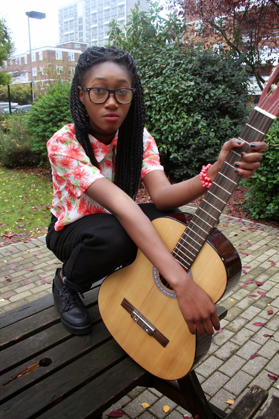
This is my new chosen picture that I will be creating my final idea for my music cover. The reason why I think that this is now a better front cover than my last chosen photo is because I have a much simple background. Due to this it will make sure that  I see the masthead, sell line and tags on my page much clear than my other (failed) front cover because of the clash of colours that going on in the background. for This I duplicate the picture on to my old one so I don't lose my work.

2) Masthead
To make my masthead stand out against the background, I just the colour green for my colour. It links to the reason for the natural because it makes you think about nature and green being the colour of that. Also I have added a shadow behind my writing to make it stand out for in my masthead.

3) Slogan
The slogan has the word 'not' in with a line through the word, in bold and in pinkish colour   right in the middle because it's emphasis the idea the this magazine looks at music thats not electrical based of music. Also it's a play on word of "batteries not included" so think that it was a smart idea to used as a slogan.

4) Colour Scheme 
As you can see this is the shirt that my model was wearing. I going to make sure that I will only use the colours of white, pink and green to show that my other sell line are linked and that its better so that I done over crowed my front cover with different colours.

5) Positioning  
When looking at other magazine front covers, they really make sure that they positioning of the text if clear to read and has enough to space to show the different articles. When making my magazine cover lines, I need to make sure that use the positioning effectively.

6) Barcode
              
It wouldn't be a magazine front cover without a barcode. When shooting this photo, one of my model's items of clothes got into my photo frame. I thought that by placing the my barcode there, it would hide that mistake and it's a great place to put my code without it getting in the way of my cover lines.

Friday 12 December 2014

Magazine Development: Front Cover Pt 1:

This post will show you my progress through out the time making my music magazine front cover.


1) Masthead
In this screen shot, I am adding my masthead to the selected picture that I have chosen. This is one of the few font styles that I though of using it for my masthead and is in my pitch for DaFont.


The next step that I did was use the "Magic Wand Tool on on Photo Shop to get rid of the white box that is around my title. 

Now, I was able to use the "Paint Bucket Tool" to make my masthead top have a white colour to stand out against the colours background. the reason why I have chosen to using white because it stand out the best against the background.

2) Slogan

The slogan has the word 'not' in with a line through the word, in bold and in red because it's emphasis the idea the this magazine looks at music thats not electrical based of music.


3) Cover Change
After adding the sell lines and other text, I have realised that there are too much colours that are happening in the picture. Also due to the background, I have realised that it can be hard to read.


For these reason, I will be changing my front page cover to another picture that was in my Top 7. The picture that came second was picture 2 so that is the one that I will be using as an better front cover.

Thursday 11 December 2014

Top 7 Photo

I asked my teacher to look at my photos and thought that these where my best 7: 
1.                                                    2.                                                   3.

4.                                                    5.                                                   6.

7.
To make sure that I have use the best photo for my front cover, I will be asking my classmate to choice which on is the best. I went around the classroom and did the tally and these are the results.

1) 1           2) 8            3) 0           4) 2              5) 0           6) 9           7) 0


Winning by 9 votes, I will be using picture 9 for my front cover. I think this will be a good picture to work on my front cover because I liked the away that postioned my model and how the leaves are place on the floor.


Wednesday 3 December 2014

Photo Shoot Day!!!

Sorry for the big delay of my updates. The reason why I took long to update is that my other classmates had been using the same camera that had my photos. Had to track every camera to find mine. 

Here are the photos that I took for my front cover and contents page: