Friday 27 February 2015

Magazine Development: Contents Page Pt 3: Development

After looking at my content page with my teacher and my classmates, I have realised that there is room for improvements to make my content page better than before.

1) Background
The reason why I changed the background because my class thought that it was just too much having two colour. So by using the "Gradient Tool", I made it only one colour form my previous background (which is the green) and let it fade out toward the ending. 

2) Taglines
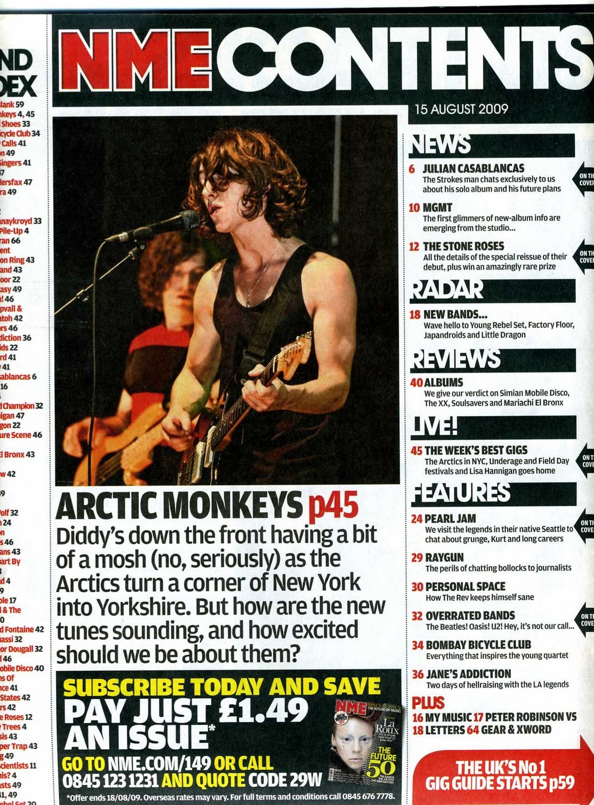
My class found that the previous way that I did my listing of my content's stories were to crowed, so my teacher suggested that I should make it smaller and put my stories in a box to help organise them. By doing this it has allowed me to make more available for more ideas to be fit in. This as help make my contents page look less crowed and have a neater look. I change the colours of my numbers to make a clear to show that they are different stories for each stories.

3)Anchoring Text
Due to the colour change in the background, I have change some of the colours of my anchoring text. to keep with the theme colours of the green, white and pink, I made my artists names in pink to make them stand out against the fading green. Around the top left and bottom right corners of the page, I have added the page number and the title of my music magazine on there. I did this as it follows the same idea of other music magazine contents to have their symbol and page number on their contents pages. The "connect with us" is along the bottom along with the other social links and this make it look like other music magazine to have their in clear but small space.

4) Title
Change the title just to say "contents" because my audience already that it's about what's going to be inside due to the number on some of my stories. I changed the colour so that it can stand out more.

Friday 20 February 2015

Magazine Development: Contents Page Pt 2: Text

1) Anchoring Text
I have added simple anchoring text to clearly show that I am introducing the model as the top musical celebrities. The "new artists" stands out against the white background, just like the artists names against the main green and pink background. 

2) Title 
With the title, I made sure that it has the biggest front size and still kept the front colour with as I want to make sure that it stands out against the green and red background. I like that I have your a simple front style as I think that it links to my stripped back acoustic sounds idea.

3)Taglines
For my taglines, I like the way that I have underlines the the article as I think that it makes it clear they are the title of the new articles. In addition to this, I have made sure that I have titles the different parts of the magazine stories with different titles and using the space effectively. I think that it shows the division that magazines have when showing what other things that they have inside.  

Wednesday 18 February 2015

Magazine Development: Contents Page Pt 1: Layout

These are the stages that I followed when making my content page: This post it just looking at the layout 

1) Background
I want to make sure that I keep the same colours as my front cover. I like how I have used the "Gradient Tool" to create this effect to make the my colour seem to fit together. This will make it easier for my to put my white text on because it make it clear to see.

2) Pictures
In most magazine contents pages, they have mini pictures of the aritst that they included so who else in the the magazine. I wanted to create the same affect, so I added pictures of my models because I'm going to do an interview of them for my double page. I added the the white box to make the pictures stand-out a lot more.

Friday 13 February 2015

Contents Page Designs Ideas

These are some of the designs that I have planned out before making my final layout before making my contents. Before I got starting needed to get some clear idea on how to construct my contents page and here's the three that I liked the most.
From the three that I have drawn, I really like the three one because I can really visualise how its going to look like. The other two drawing were really good but i tried to think how it would look when physically doing but it fell a part in my mind.

Wednesday 11 February 2015

Contents Page Research

Before the half-term, I would like to complete everything before I go off so I'm to lagging behind in class. I'm going to be looking at exist contents pages and I can use their idea to help me construct my own contents page
These are some of the contents pages from existing magazine that I might use thier ideas when making my contents page. in all of them, I like how they have one colour that stands out to make it more eye catching. This is effect that they standout because it's against the a dark background so that it's clear to read.

When looking at designing my contents page, I need to make sure that I don't cover crowed my page with different colours and not my cover lines overlap with each other.